

Why I Always Recommend Neutral Colors for Your Next Photo Session
- Feb 8
- 4 min read
It usually starts the same way. Someone stands in front of their closet, coffee going cold on the counter, scrolling their phone with one hand and pulling hangers with the other. There’s a pile forming on the bed. Something feels close, but not quite right.
“Is this too much?” “Is this boring?” “Do we need more color?”
Neutral colors rarely feel exciting at that moment. They feel safe, and sometimes “safe” gets mistaken for plain. But what I’ve learned, session after session and season after season, is that neutral colors aren’t chosen because they’re easy. They’re chosen because they leave room for what matters.
The photos people come back to, the ones they print, frame, and tuck into albums aren’t remembered for the outfit. They’re remembered for the way a hand reached out, the way someone laughed mid-sentence, the way a child leaned in without being asked.

Neutral clothing lets those moments breathe. When nothing is shouting for attention, your eye goes exactly where it’s meant to go: connection, movement, emotion. The photo doesn’t feel styled. It feels lived in.
This philosophy started long before I ever picked up a camera.
Before photography, I was a teacher, and at one point I made a quiet but very intentional decision in my classroom. I stopped decorating the walls for the walls. Instead of bright posters layered on top of each other, loud colors competing for attention, or décor meant to impress adults walking through, I redesigned the space with one simple goal: I wanted the kids to pop, not the room.
I softened everything, neutral walls, calmer tones, fewer visual distractions, and added just a few thoughtful pops of color where they mattered, like books, children’s artwork, and small details that invited curiosity without overwhelming the space.
Something shifted almost immediately. The room felt grounded. The kids felt more present. Their work stood out. Their personalities stood out.
They stood out.
At the time, I didn’t think of it as a philosophy. It was instinct. I wanted the environment to support the people in it, not compete with them. Looking back now, I see how clearly that choice connects to how I photograph today. Neutral spaces don’t erase personality; they frame it. They create breathing room. They allow movement. They let expressions land softly instead of getting lost in visual noise.
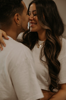
Neutral doesn’t mean everyone in the same shade of tan, lined up and smiling politely. Neutrals live in a wide, forgiving range: soft whites and creams, oatmeal and sand, warm browns, washed black, charcoal, sage, muted olive, and gentle gray.
These tones work because they reflect light softly and adapt to their surroundings—homes, fields, beaches, studios, kitchens with morning sun spilling in. They don’t compete with the environment. They belong in it.
If color stays quiet, texture steps in. A linen dress that moves when you walk, a ribbed sweater that feels like something you reach for on purpose, worn-in denim, a soft cotton tee, a chunky knit thrown over shoulders when the air cools. Texture adds depth without distraction. It gives the image something to settle into, much like memory itself.
When families or couples ask what to wear, I always offer the same guidance: don’t match, coordinate.
Start with two or three neutral tones and let them repeat naturally. One person in cream, another in brown, someone else in olive or gray. Vary the shades, mix the textures, and let everyone look like themselves while still speaking the same visual language.


When outfits are chosen this way, everyone belongs in the frame without trying to steal it. Just like that classroom, the people become the focus, not the surroundings.
Curious what this looks like in action?
Click here to view a recent session and pay attention to how the colors work together!
There are a few things that tend to pull focus in ways you don’t want: bright neons, large logos, busy patterns, and stiff clothing that needs constant adjusting. These details show up first and stay loud long after the moment has passed. They date photos quickly and draw attention away from what you’ll actually want to remember. If something feels uncomfortable or unlike you, it will show. Ease always photographs better than effort.

Neutral doesn’t mean colorless. If color feels like part of who you are, let it be soft and intentional.
A dusty blue, a muted rust, a gentle blush, or a worn-in sage green can add warmth and personality without overwhelming the story. Think of it the same way I thought about my classroom; small pops, placed with care.
The best outfits for your photo sessions are the ones you forget you’re wearing. The ones you can sit on the floor in, walk barefoot in, pull your kids close in, and laugh without adjusting. Because the goal isn’t to look styled. It’s to feel present.
Neutral colors don’t make photos beautiful on their own; they simply make space, for connection, for movement, for moments that unfold naturally. And that’s where the real story lives.
If you ever find yourself stuck in front of your closet, unsure where to start, know that you don’t have to figure it out alone. I’m always updating my Pinterest board with neutral color palettes, soft textures, and outfit ideas that photograph beautifully—whether you’re planning a family session, branding photos, or something in between. It’s meant to be a calm place for inspiration, not another thing to overthink.
And if you’re still unsure, that’s okay too. Part of my photography process is helping you narrow things down so getting dressed feels simple, not stressful. The goal is never perfection, just creating space for you to show up comfortably and let the moments unfold.


